Showing posts with label Green. Show all posts

Sunday, June 2, 2013

OPI Liquid Sand: Quick Pics & Review


The latest trend in nail polishes is the textured polish, which seems to translate into "makes your fingernails feel like they've been covered in sand paper".  This might partially explain why OPI decided to make their new finish Liquid Sand.  For me, I really like how this type of polish looks but I don't particularly like my nails feeling so gritty and scratchy that I'm afraid to rub my eye for fear of cutting my corneas.  Here's some photos of what I've picked up so far:
Stay The Night from the Mariah Carey Collection
Never a fan of the singer's music but at any rate, I still very much like this polish with it's glitter that lacks all the sparkles which usually comes with a glitter polish.  If they made a version of this with orange glitter in it, I'd buy it in a heartbeat because it would like the the lava and ash from a volcano.

Jinx from the 007:The Bond Girls Collection
I hadn't planned on buying Jinx but when I saw it in the store, I couldn't resist it.  Its coral/orange/gold tones are a perfect summer shade and I'm going to be keeping this one on my toes for a while.  Mainly because Liquid Sand polishes take more time to remove than the more traditional polishes and I've found that using pure acetone is the best way to remove them.

Vesper from the 007:The Bond Girls Collection
This one was the shade I had originally stepped into the store for.  It almost looks like mud in the bottle and lacks reflective properties but I'm still found of it.  I love a deep dark purple.

What Wizardry Is This? from the Oz: the Great & Powerful Collection
You know what other colour I like?  That's right...Green!  What Wizardry is This? is more of a khaki and despite being a dark colour, it has lots of sparkle to it.  I took a purposely blurred photo to emphasis that fact.
What Wizardry Is This? from the Oz: the Great & Powerful, Out of Focus
I've noticed a few nail bloggers have found the dry time on Liquid Sand polishes are very long but I've found my experience to be different.  These polishes dry to a matte like finish which usually dry quicker than a more traditional polish does and that made these my "go to" polishes during tax season when I worked a lot of overtime and did have much "me" time.  I also like that they stick to your nails like glue and can wear them for up to a week at a time and not see a single chip.  Tip wear, yes but no chips!

So I'm not sure how long this trend will last. It wasn't long ago every polish company was rushing out "crackle" polishes that are now heavily populating clearance bins or magnetic polishes that are collecting dust on store shelves.  I guess I'll enjoy it while it lasts....


Sunday, May 26, 2013

200th Post: Celebrate With Some Polish Pics!

Thought I would take a break from feeling bad about myself to post some polish photos.  Seems like to took me a while to get up to 200 posts but somehow I got there!


Run don't walk to your local Sephora and buy the Chaotic top coat from their Sephora X polish line.  It's now my favourite top coat of all time.  Chaotic is a glitter polish except for the particles are not super shiny and that makes the top coat look like Jackson Pollock rose from the grave just to splatter paint all over your nails.  It's layered over Hampstead Gardens by Nails Inc. and I love it!!!


Jamaica Me Crazy is your typical summertime pink polish but I am always found of a pink that's heavy on the blue.  I remember the formula as being a little bit more durable than Essie usually is.

It's been a while since I've set foot in a Joe Fresh and I still have a few photos from their polish line that I hadn't posted yet, so here they are:


Mallard is a dark green creme that is actually as glossy as it appears in this photo.  I'm not sure if they still make it but if they do, it's a classic fall colour and not a waste at $4.


I'm not as enthusiastic about Mist.  It's a light frosty green tone and it's nice enough but it's nothing to shout about either.  It dries quickly though, so if you are looking for something to quickly do your nails with, this one's a safe bet.


This one has me stumped.  When I found it in the store, none of the bottles had a label that indicated its name.  It's a nice Blurple but it has a few issues with streaking, which you can see in the photo.


Rusty from Gosh is definitely going to be going back on my nails this summer as it's a great bronze shimmer with good wear time.


I think I might have had Essie's Sag Harbour before I started writing this blog, so I guess it was time to post it.  Again, this is a colour that says summer and is exactly the type of colour I like to sport while swimming in the ocean!  God, I want to go back and see my family in Barbados...:(


She's Picture Perfect from Essie is a lilac colour I liked much, much more in the bottle than I like on my nails.  It didn't quite go with my skin tone and you can notice some patchy bald spots that made the application less than stellar.

Anyone one who has checked out this blog knows about my goofy/sad/manic/self-deprecating obsession with actor Tom Hiddleston.  Well, this Wednesday, it got even worse!  I guess I'm going through a mid-life crisis and so while some people buy expensive sports cars or cheat on their spouses, I decided to do something else.  After waiting almost a entire year, and paying for it on installments (because it is that expensive) my Hot Toys Movie Masterpiece 1/6th LOKI finally arrived at my doorstep and man!  Is it something to be seen:

No, I Did Not Happen to Bump Into Tom Hiddleston on the Street While He Happened to be Wearing Full Loki Regalia!  This is s DOLL!!!
If you're not familiar with deluxe figure manufacturers Hot Toys, then you should know that they are arguably the very best at facial reproduction of the a film's original character.  He has wrinkles on his forehead and tiny freckles on his face and neck with what I assume is a brush made with one single hair plucked from the eyelash of an angel.  I have not even begun to take pictures of my 1/6th sized imaginary boyfriend  but would like to do a full length review because this thing is so damn awesome!!!

Wednesday, July 18, 2012

Where's the Party? by Essence


A quick stop in a Shoppers Drug Mart on Dufferin Street & Lawrence Avenue led me to an almost empty display rack of Essence cosmetics.  I'm curious to know why I've never seen this brand of makeup in any other SDM in the GTA except for that one.  They certainly don't carry it anywhere near where I live.

I bought 2 polishes and one of them was Where's the Party?, a purple green duochrome that leans a bit on the frosty side.  Considering the cheap price, it was less than $2 CDN, it's a pretty decent looking polish and has some really nice tonally transition to it and it looks good.  However, I got to tell you the formula was hard to work with.  It was too thick, bubbled and actually lived up to the promise of being a quick dry polish by becoming extremely sticky coming out of the bottle by the time I got to the second coat.  I doubt that I'd be able to get 3 more wears out of it before it would begin to dry up and be unmanageable.

Friday, July 13, 2012

Cosmetic Art's April Showers

While browsing one of my favourite stores to buy nail polish, I came across a display for a brand I'd never heard of before: Cosmetic Arts.  A quick Google search gave me very little information about the line but what little I did find (and from the tiny fine print on the back of the bottle), CA is onwed by The Forsythe Cosmetic Group who owns the well know Color Club brand.  I have a few CC polishes (7 bottles) and I like them well enough but in my opinion, this one bottle of April Showers was a better polish than all of them combined.  The photo above doesn't completely capture just how lovely the colour is.  It does have that beautiful blue & green flash to it and I'm a sucker for anything that invokes the image of the ocean. But what the photo doesn't show that is the polish also reflects with a light pink shimmer.  The brush was very wide and gave very good coverage with 2 strokes on the nail.  Granted it is a sheer colour, that's 3 coats pictured, but it was also an extremely quick drying polish and I didn't need to use any additional drying methods to get it to set.


Saturday, June 30, 2012

Ok, I'm Giving This Nail Art Thing A Try...

But bear with me as results may vary!  I'm starting to give nail art a try since I have so much polish (but not a lot of time on my hands) that I thought I should at least give some new things a try ever once and a while.  Plus it's a learning experience and I just haven't had enough of those lately.  So a couple of weeks ago, my sister, my long time buddy and one of my employees trundled off to the AGO's Picasso: Masterpieces from the Musee National Picasso, Paris which offers a rare opportunity to see some of his greatest works without having to go all the way to Paris.  I liked the exhibition but I think that my tastes lean more to Chagall, there is far less of an giant ego in his work than the giant ego that seeps out of almost everything Picasso did.  Oh well, personal tastes!

But I just wanted to wear something a little different that weekend, so I opted for some layering with 3 different polishes. I simply applied the coats in smaller areas.  For the base, I used Mac's Liberty of London in Blue India.  It's a dark & slightly dusty blue creme.  The second coat applied was Little Italy from New York Colour's Minute Quick Dry.  This colour is simply an opaque white creme, defiantly a shade that I would never wear on my own (and a little streaky I might add...). The third and final coat I used was China Glaze's Westside Warrior, a dark green creme which I reviewed last year.  Here's the results:

It's a bit sloppy and I had some issues with bubbling but when you're applying up to six coats of polish that is going to happen.  Although I didn't have the steadiest of hands that day, I certainly do like the colour combination a lot and I liked the change from the usual straight polished nail.

My sister tells her coworkers that I am suffering from a severe case of Hiddles Palsy, an affection that causes me to stare at pictures of Tom Hiddleston while simultaneously smashing my face into my laptop screen all day long.  It's true but what I am going to do with my spare time anyways?  Date a real person?

LOL!!! NO F******G WAY!!!!
Real men can be such a bore....

Tuesday, June 19, 2012

The Amazing Spiderman Colours from OPI


Ahem...Glad to get that off my chest, again.  The Amazing Spiderman could turn out to be a perfectly acceptable movie but it's going to take me a really long time to find out if it is because of Andrew Garfield and his yucky behind...he just turns me off so damn hard...

Thank Goodness I didn't get turned off by OPI's Amazing Spiderman Collection though.  I wasn't looking too forward to the latest of the movie polish tie-in's since I found the quality of OPI polish in the past year to be significantly lacking.  It appears to be turning around because this collection seems to have gotten back to the kind of polish quality I'd come to expect from the company.

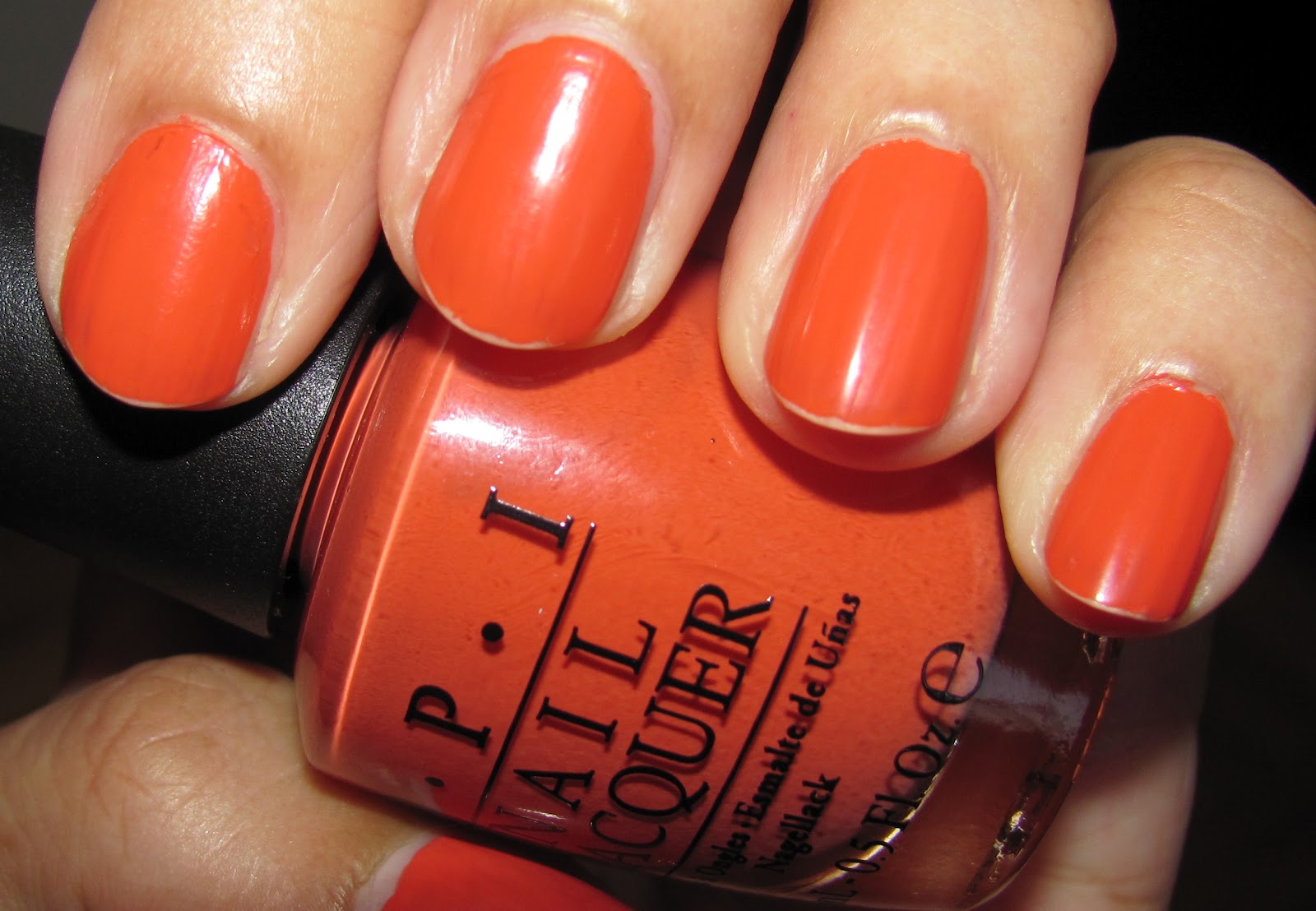
Call Me Gwen-Ever is a bright coral creme that is so pigmented that it went on streak free and almost opaque in just one coat.  And that's exactly how many coats I'm wearing in the photo above...one!  How's that for a big step back up to quality?  Now I've got to admit that Orange is not my favourite colour by a longshot:  I don't enjoy looking at it but I actually look fantastic in the colour so I've got a lot of it in my closet and in my makeup drawer. The one thing that I don't like about CMGE is it's name.  Considering the fate of Gwen Stacey in the Silver Age comic, well, Call Me Gwen-NEVER if that's what you consider "saving" some one's life...
WHOOPSIES!!!


Number One Nemesis is a dark green shimmer that needs at least three coats if you want to achieve a smoother and even coat.  It's pretty but it's way too thin and sparse that I can't really say that I'd recommend it highly.


But Into the Night is another story all together.  I absolutely love this colour!  A dark blue shimmer that otherwise defies a more detailed description for it.  It has the same kind of application issues as NON but it's so damn pretty I couldn't stop looking at my nails when I was wearing it.  That's hardly productive but come on, look at it.  I did not expect to love it so much.

Yeah, so I'd probably see the new Spidey if that Garfield guy didn't make my ladyparts dry up.  But if you read this blog, you already know what I like...Hey everybody!!!  What's green, has two horns coming out of his head and touches himself whenever I think about him?

Yeah Baby...Just Like That!


Sunday, June 17, 2012

Capital Colours from China Glaze

Yes, I know it's long overdue and many of us have moved onto brand new collections but I'm still going to put in my two cents on the remaining Hunger Games polishes from China Glaze I picked up a while ago.

Fast Track is a light gold shimmer that became a favourite of mine pretty much after I applied the second coat.  If you're looking for a subtle and simple hue with a good amount of shine that you can sport just about anywhere, then FT is a great choice.  It may need a third of fourth coat if you want to achieve bottle colour but I like it with just two.  I didn't experience any application problems and it dried quickly as well.

 
When summertime comes around, I cannot resist a good metallic polish, particularly a really nice bronze like this one.  When I looked at Harvest Moon in the bottle, I felt very sure that I was going to be having some serious streaking problems but fortunately, none of that happened.  This red toned bronze went on smoothly and I got about 4 days of wear out of it before my tips started peeking out.
 
Smoke & Ashes was extremely difficult to photograph.  The blue/green/black shimmer was a super thick polish that took extra time to dry and was surprisingly difficult to remove.  Some of the shimmer particular didn't come off without buffing and even after that I still have a few stubborn pieces that I don't think will disappear until the nail grows out.  I like how it looks but I don't like the hassle...
 

Blurred So You Can see the Shine!
Since I found that Smoke & Ashes was such a pain to remove, I don't know what I was thinking when I layered the Luxe & Lush flakie top coat over it.  I'm always going to buy a flakie polish when I see one.  They are in surprisingly short supply in the GTA and I much prefer them to glitter polish. So as much as I like its broken glass look, I had to use nail glue remover to get it off...Yuck!!!
 
Now about the movie...
I went to see the Hunger Games not out of a burning desire to see it but more out of a feeling of obligation.  I've spent too many years complaining about the lack of female action heroines (well, just a lack of good female characters period) and it would have been hypocritical of me not to go see it.  Plus I had a rare amount of spare time during a weekday afternoon, so why not take in a $7 movie?

While it's not one of the best movies I've ever seen, it's far from the worst too and frankly, if I was 12 years old, I would've that it was the very best movie ever made (until The Avengers came out) because Katniss is a smart, compassionate & noble ass-kicker who despite having two love interests, she pays more attention to the fact that people's lives are at stake.  I never got the feeling that she has deep feelings for Peeta, she's just not the kind of person who would leave some weakling in a hole to die all alone. At least it's the anti-Twilight.  If I had a tween daughter, I'd sleep better at night if she was into this as opposed to that sparkle vampire/ugly werewolf claptrap.  At least she might be more understanding of the fact that, guess what?  Life is hard and most of the time it's a huge struggle!

Friday, March 9, 2012

Navigate Her by Essie

As much as I love green polish, I find myself on the fence with Essie's Navigate Her from the 2012 Navigate Her Spring Collection.  Looking like the most intense pistachio hue I've ever seen, it's a light green creme that was a weird mix when it came to application.  The first coat was extremely thin, the second coat wasn't enough and the third coat was super thick.  Even with that thickness and quantity of coats, you can still see that I had some bald spots, particularly on my pinkie finger at the top of the nail.  On top of that, I don't think this colour suits me.  I don't spend a lot of time bragging about myself but one thing I'm usually confident about is that almost any colour suits me and this one doesn't quite feel right.

Monday, January 23, 2012

Viridian by Illamasqua

When I first saw Illamasqua's Viridian, I couldn't wait to get my hands on this peacock green from a brand that many nail bloggers seemed to be crazy about.  This is my second experience with the London based brand and I have to say that I'm just not wild about this line of polish.  Granted, the polish experience wasn't anywhere near as bad as it was with Scarab (no human hair in the bottle and no dripping).  The large square brush handle is still unwieldy but to add to the disappointment, the formula of Viridian was just not that great.  The brush dragged across nails, got goopy quickly, the polish bubbled in some places and worst of all: it chipped in less that 8 hours and that's a deal breaker as far as I'm concerned with a polish.  Illamasqua's quality has just  been too inconsistant for me to spend anymore money on them.

That being said, I still wouldn't say no to trying out the other types of makeup from the brand.  Just because the nail polish was a dud doesn't mean that their lipsticks would be too.

Monday, December 26, 2011

Emerald Empress by Sally Hansen

Christmas has come and gone, I am tired, tired, tired and the holiday season isn't even done yet as we still have New Years Eve to look forward to or contend with (depends on how you look at it).  I haven't had too much time for posting but I just had to take some time to drool over Sally Hansen's Emerald Empress from their Insta-Dri Line.  This polish straddles a fine line between blue and green but regardless of what your eye thinks it sees, it's still seeing a beautiful colour.  This deep shimmer polish had full coverage in two coats and true to it's name it dried very quickly.  It also had very good wear time as this picture was taken 3 days after application.  The Insta-Dri line is 50/50 when it comes to durability so it's great that this one lasts a bit longer than others.  The obvious downside to a polish like this one in the unavoidable staining of the nails that these kinds of colours cause.  So be prepared to take some extra time for removal.

Friday, December 2, 2011

Veruschka By Zoya


 Matte & Suede finishes had a brief time in the sun a couple of years ago as the new "It" finish.  Despite the fact that this trend is done for now, I still really like mattes & suedes.  But I think what buyers didn't like was the formula's fragility.  One had to be thankful that these types of polish dried quickly because they would chip within minutes of application.  Zoya's Veruschka was no exception to this problem.  It had tip wear in a few moments and was terribly chipped by the next morning.  It's pretty as anything but a trial to wear.

Friday, November 11, 2011

Yara By Zoya

Zoya may be one of my favourite brands when it comes to nail polish but I should have know that someday, I would buy one that failed to meet my expectations...Yara is that polish!  Of course I like the colour. Olive green is a big trend this fall and this muted tone with the gold shimmer is easy on my eyes. Colour is the primary factor of all of my polish purchases but quality is a major factor as well.  And I'm accustomed to quality from the Zoya brand and unfortunately, Yara is not up to snuff.  You'll notice that there's visible tip wear in this photo and one expects that after a couple of days but I only polished my nails about 7 hours before I took that photo.  If I'm going to sport a meduim olive green nail again soon, I'll choose Estee Lauder's Metallic Sage.

Saturday, November 5, 2011

Total Eclipse of the Heart From Color Blast by Orly

If you live in the GTA area, you may have noticed a new polish brand on their cosmetic shelves: Color Blast by Orly and frankly, I wasn't seeing anything in this line to really set it apart from the many, many others that are out there.  In fact, I didn't see anything different in the polish that I ended up purchasing, Total Eclipse of the Heart.  It's a green/purple, shimmer intensive, duochrome...
and that's a long description for something that although it is very nice, it's no standout from an already crowded market.  Now, that's not necessarily an insult because if you wanted to pick up MAC's Mean & Green from the Venomous Villains collection but missed out, this is a fair substitute.

TEFTH is surprisingly the greener of the two but they are kissing cousins. I would be remiss not to give props to the formula which was good, applied easily and didn't chip after three days.  It may be a new line but Orly's been in this business for a while now and if they are going to be asking for nearly $10 CDN for a bottle of drugstore polish, they need to step it up in terms of shades and innovation.

Monday, October 3, 2011

Uh Oh, Roll Down the Window by OPI


I've been buying nail polish since I was in elementary school and I can safely say that this is the first time I have ever seen a polish that suggests it was named after a fart.

I Would Have Preferred Silent but Deadly
OPI's Uh Oh, Roll Down the Window is the guilty party here.  Even the Urban Decay line (when they debuted and were actually edgy...now they're very middle of the road in my opinion) with product names like Bruise, Oil Slick and Roach, they didn't go there with creative monikers but I guess OPI wanted to have a bit of fun.  I get the roll down the window quip is connected to the road trip theme for the Touring America collection but let face it people.  Farts happen everywhere!

And When They Do, They Leave Burn Marks On Your Carpet.
Olive green polish is also everywhere this fall but I think I'll keep my purchases capped at Uh Oh and China Glaze's Weekend Warrior.  Uh-Oh is a dark green olive cream that, in comparison to China Glaze's WW, is far, far less pigmented.  While WW was very opaque in 2 coats, Uh Oh's formula was thin & a bit runnier than WW.  I didn't get complete coverage in 2 coats like I normally do with an OPI polish and considering how much I disliked sister polish Color to Diner For's application, I'm starting to get a bit concerned about the quality of their polishes lately.  Especially since Uh Oh chipped after only one day of wear in which the most challenging thing I did that day was eat brunch.  I definitely like the colour but the disappointing formula makes CG's Weekend Warrior the better option. 

That juicy bum up in that screen grab belongs to one of my all time favourite cartoon characters, Stimpy from The Ren & Stimpy Show.  It was wildly popular during the early to mid ninties and for a time, you couldn't escape the show or its oddball sense of humour and my two favourite episodes were Space Madness and Son of Stimpy...

 in which Stimpy, the stupidest cat that ever lived, blows out a huge fart and becomes convinced that he's given birth and leaves home to find his lost "son":

Have You Seen This Fart?
How could something so gross be so heartbreaking at the same time? I don't how it works, I can only tell you that it does!  This show was created by animator John Kricfalusi, who I thought had practically fallen of the face of the earth in the last couple of years so imagine my surprise when I was watching The Simpsons and lo and behold:  The couch gag was animated by the one & only John K!  Long time no see!
Missed Those Crazy Lines!

Sunday, October 2, 2011

Peridot by Chanel

I have had a rough couple of weeks at work and was feeling exhausted and deserving of a reward for all of my efforts so I took a quick trip to my home town of Montreal and when I got back I decided to treat myself to my very first Chanel polish: Peridot.  I have to admit that I tried very hard to disguise the sense of dismay I felt when the salesgirl announced that the single bottle of polish I was buying would set me back about $30 CDN but I began to relax a bit when I got home and took it out of the bottle I could see this gold & green/blue douchrome is so damn sweet!  The gold tone puts me in mind of old tarnished door keys and the green is like the little touch of corrosion that occurs on copper that's been exposed to the elements.  Unlike a lot of douchrome polishes, this one photographed really well.
It's Green!
In terms of application, the formula is top notch.  I had very little streaking on my left hand (but a little bit of streaks occurred on my right hand), it dried extremely quickly and got full nail coverage (no bald spots) in just two coats.  But the best part is the fact that I wore it for three days and there were no chips, cracks or tip wear at all!  Peridot pretty much looked I like I had just applied it and probably could have went up to five days of wear.
No, It's Gold!

I may have cringed at the price tag initially but I'm so glad I didn't waste my money on something sub par, especially after after the disappointment that was OPI's Color to Diner For.  I will definitely try Chanel polish again.